

When lightning strikes: A conversation with Cassie Vu, Senior Designer at Random House
The book cover design process from start to end, trends, negotiations, Victorian jewelry, AI regulations, and everything in between

Hello! This post is slightly different from what I usually write because I’m interviewing the wonderful Cassie Vu, Senior Designer at Penguin Random House, about the fascinating world of cover design. I love hearing about what people do (provided that what they do is interesting, sorry) and wish I could trail her around the office all day like an intern with absolutely no skills.
Before diving in, I want to share some funds that you might consider donating to to support Minneapolis, detained immigrants, and frontline organizers.
Support the Immigration Bond Freedom Fund | Support frontline organizers | Directory of GoFundMe’s and other campaigns
How does a book get its clothes?
I’ve always maintained that I have too much respect for the design profession to not judge a book by its cover. I don’t envy the job of a cover designer, though I do envy their desks. Visually capturing the spirit of an entire book, while also making sure it can hold its weight in a bookstore or phone screen, is no small task.
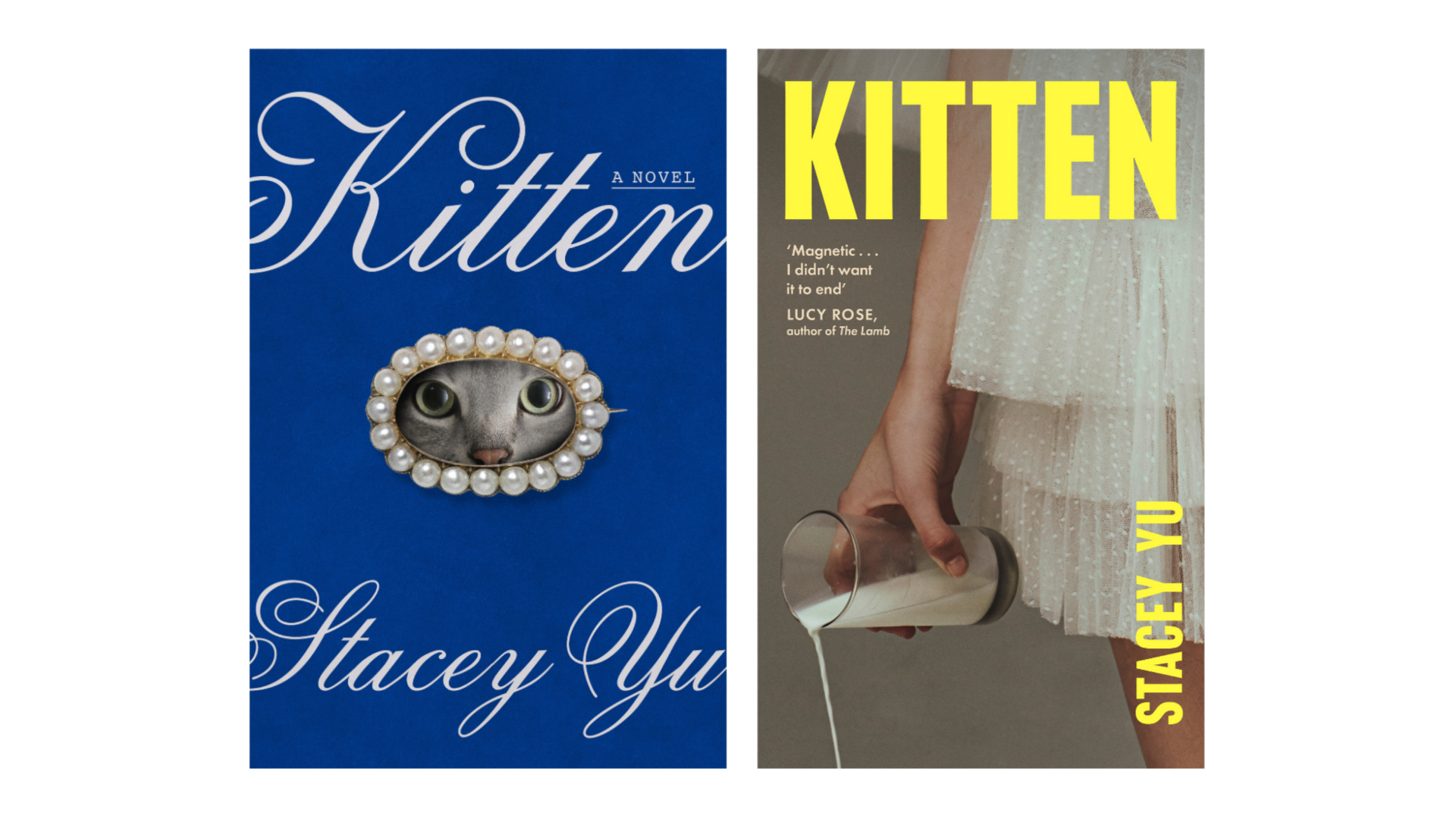
Because my novel comes out in the US and the UK, and the markets have quite different aesthetic preferences, I’m lucky to have two covers. I just adore them. The blue on the left is the US cover, designed by Cassie, and the yellow on the right is the UK one, designed by Saffron Stocker.
I was already a follower of Cassie’s work and was delighted to learn, when my cover was near completion, that she had designed it! Energized by the speed with which we landed the cover (3.5 days), the general frenzy and bonhomie of the holiday season, and my being a previous fan, I slid into her DMs to gush. Pretty soon, I knew I wanted to interview her to learn more about and share the mysterious and layered and very diplomatic process of how a book gets its clothes.
So without further ado: here’s Cassie!

Enter Cassie: Prior gymnast, avid reader, and cover designer extraordinaire
Can you tell me a little about yourself?
I’ve been working as a cover designer for 10 years, and I mostly work on fiction. I have a particular love for 700+ page novels and realistic romcoms. Outside of book design I’ve had a photography business since I was a teenager. I love to draw, paint, embroider, cook and bake, and recently I’ve gotten into floral arranging. I was a gymnast growing up, and now I like to run half marathons very slowly. The cool thing about book design and working on so many different projects is that I know that eventually, all of these interests will show up in my work in some way or another!
What about book design appealed to you?
Reading has always been a huge part of my life. Even in high school and college I was reading 60 to 80 books a year. You don’t have to be a huge reader to be a book designer, but it certainly helps! I think my editors value the fact that I connect with the books, and that I’m the target audience for a lot of the books I design.
An art, not a science: The making of a book cover
Even as an author, the design process feels mostly like a mystery. Can you describe it from beginning to end, starting with: how does the process kick off?
In my department, we get to request what titles we work on. We have 3 seasons per year - Fall, Spring, and Summer (who knows why there is no winter season). So three times a year, I’ll make a list of about 10 books, ranked in order of preference, and I usually get assigned about half that I request and half that I don’t. I typically have 7 to 10 frontlist1 hardcover titles per season. We also have paperback repackages, reprints, special editions or special projects (like my Bantam Classics series) that add to the workload, but the frontlist is the bulk of it.
The process can be different for each book, but personally, I start each project by reading the manuscript and doing image research. The editors will give us a brief with thoughts about the target audience, the author’s notes, the settings or characters if necessary, and comp titles - books that are similar in tone and genre - which is probably the most important part! My personal favorite projects are when the editor will provide all of that information, and then say something like “but we trust your judgement, and feel free to bring any ideas to the table.” That’s what happened with Kitten, and obviously it proved very successful! :)
What happens after the initial exploration?
Once I’ve done about 10 to 15 options for a cover, they go to our weekly cover meeting. If you’re an art school girlie like me, a cover meeting is essentially the corporate version of a crit, or a critique. You show your work, and then everyone stands around discussing it for 5 to 45 minutes while they try and figure out if you are a genius or if you are a stupid idiot (they don’t actually say that, but sometimes it feels that way).
It’s typical to have 20-50 different cover options that never see the light of day.
And then rinse and repeat. I would say we usually go between 3 to 5 rounds of revisions, with varying degrees of starting over and scrapping all the work you’ve done so far. It’s typical to have 20-50 different cover options that never see the light of day. Kitten was unusual in that I nailed the concept in the first round, but we did have approximately seventeen cat variations (and ended up using the original cat anyway). A majority of the time, we do at least one or two rounds at our cover meeting before even showing the author!
[Note from Stacey: Below is a sample of the different cats we deliberated over… at the very end, you can see how we tweaked the cat’s eyes to be rounder and wider, and less menacing. I kept saying: but can we make it cuter? Cuter?!]
And then?
Sometimes people think our job is done once the cover is finalized. I freaking WISHHHH! After we get the jacket file, otherwise known as the mechanical, all set up, we have to proof the cover. This happens in house on our Epson printers that replicate what the actual printer will do. I could get really in the weeds here explaining, but basically, book cover printing is nothing like a regular laser color printer. It’s more akin to screenprinting, where the colors are laid down individually on a large press. Sometimes we get to proof on the actual cover printers (this requires both time and money, which we don’t always have). If we are considering multiple effects and paper finishes, we’ll proof the jacket multiple different ways. Even after a jacket is finalized, printed, and published, there can be reprint adjustments, award seals, book club picks, New York Times Bestseller line additions (if we are lucky), etc.
So we do all that work and sometimes a cover STILL doesn’t print the exact way you want it to. It’s an art, not a science.
To you, what elements make a book cover successful?
I think there are only 2 things really. 1) Does the cover make you want to pick up the book, and 2) does the cover make sense to you when you finish reading it. Pretty much any good designer can accomplish number 1, it’s number 2 that has to click!
Beyond its representation of the book, what else do you consider when designing a cover? How do trends factor?
Much to my chagrin, we live in a digital world now, and a majority of people buy books online. Covers absolutely have to look good at thumbnail size, so these days you see a lot of big type and bright colors.
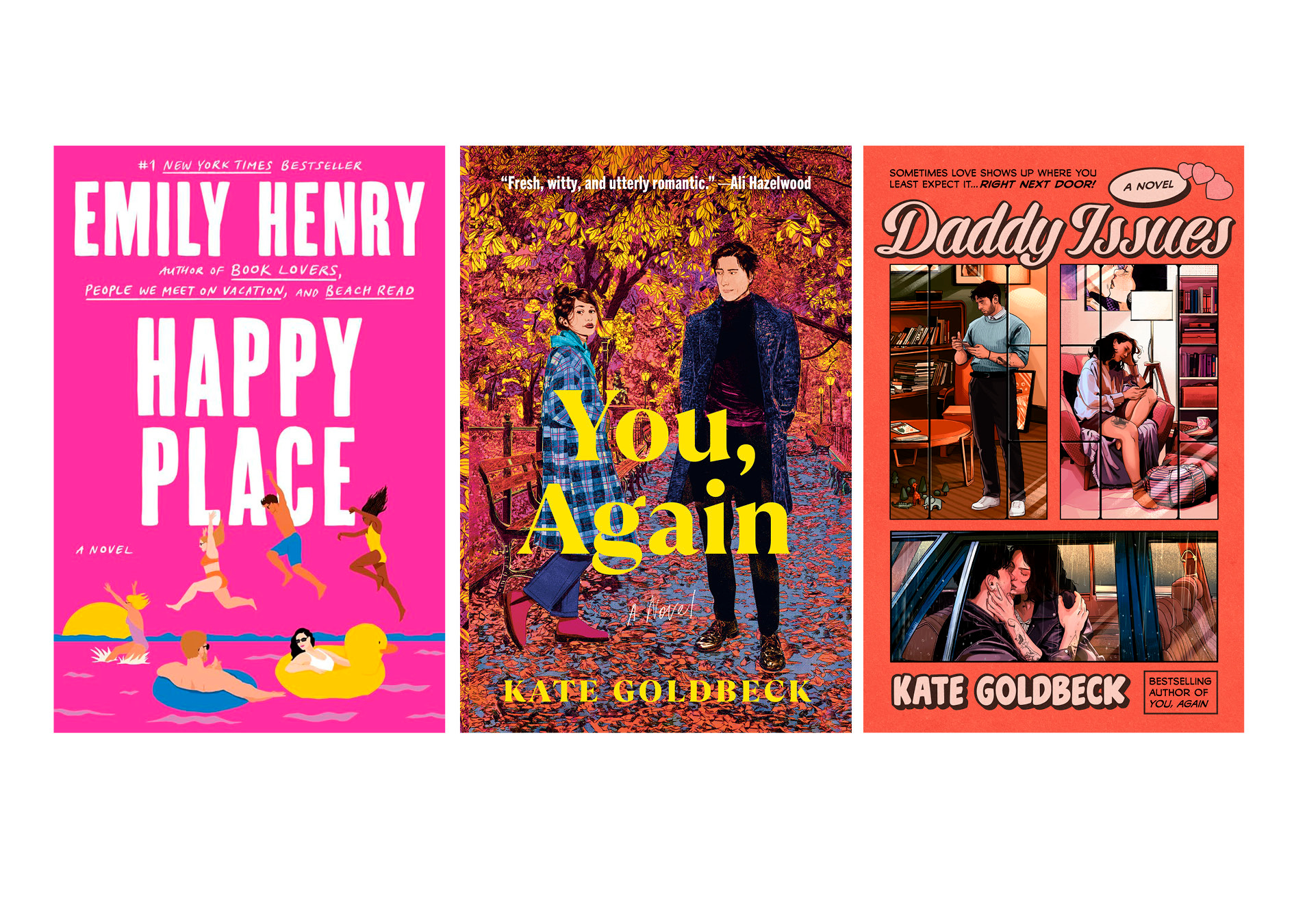
We also tend to work a lot within genre. Take romcoms, for example. The current trend is the Emily Henry look, flat colors with less detailed figures (popularized by the AMAZING Sanny Chiu, who is a true gem). But now the pendulum is swinging in the other direction, due to reader fatigue. How can we make a more detailed illustration fit on the shelf with the rest of the covers in the genre? That line of thinking gets us towards the covers that I did for Kate Goldbeck, for example.
You read all the books you design. Can you describe how that affects the way you read a manuscript—are there certain things you look out for?
I am very lucky to be a super fast reader (about 2-3x faster than average), so sometimes I actually will read a manuscript twice. Once for enjoyment and ~vibes~, and then again for details I can pull out to represent on the cover. I do a lot of highlighting, either on my kindle or a printed manuscript, and I’ll go back and reflect on the passages and see if there are repeating motifs that stood out to me. If I’m in the right headspace I can accomplish both things at the same time, but it really just depends!
A negotiation and a collaboration: Bringing people in
From my day job in branding (I am not a designer, but I work with them!), I know that getting a design on paper is only the first step. You then have to contend with a whole cast of decision-makers. How collaborative is the process, and how does that affect your work?
I think the amount of people who have their hand in what a cover looks like would shock the average reader. Before the author even sees cover options, they are looked at by the editor, the editorial assistant, the publisher, the deputy publisher, my art director, creative director, and sometimes the sales team and marketing team. The author’s opinion will always be weighted the heaviest, but all of those other people weigh in too. So a lot of the time I’m thinking in the background “does this particular editor like this style of work? Has the publisher seen something like this before?” Every single decision is made with intention, whether it’s my intention or someone else’s!
Why is the process so removed from the author? For reader knowledge: authors have absolutely zero interaction with the designer; everything, including feedback, is liased through the editor.
I don’t know the true reason, but my best guess is just efficiency for the process. An author’s book is their baby, but I’m juggling 7 to 10 different babies at any given time. Assume a minimum one-hour conversation with each author and that’s already 10 hours out of my 40 hour work week! I just don’t think it would be possible to do.
We can usually get just as good of a result if the author simply says “here are 5 book covers that I like, can you do something like that?” At the end of the day, a book cover is an interpretation, and I can interpret just as well from a set of notes vs speaking to someone directly!
Cover design, like everything in publishing, is a negotiation and a collaboration, but the author rules all.
Way before the cover process even started, I made a PowerPoint of covers and design elements I liked. I know sometimes authors bring in Pinterest boards. How do author preferences and input affect your design process? Generally, how much sway do you think authors have over their own cover? You can be honest!
They have TONS of sway!!! I don’t know where the myth originated that authors have no say in their covers, but at least at Random House, and everywhere else I’ve worked (4 out of the big 5), the authors have the number one input. Of course, it’s filtered through the editor, and about 1 million other people also get to weigh in, but if an author puts their foot down, I can honestly say I’ve seen it respected 100% of the time, regardless of if they are a debut author or a bestseller one million times over. With genuine regularity, we scrap cover versions just because the author isn’t feeling it. Of course, no one is getting exactly what they want 100% of the time (least of all me), but if an author doesn’t love their cover, I’m not doing my job correctly! Cover design, like everything in publishing, is a negotiation and a collaboration, but the author rules all.
The nitty gritty
Where do you find inspiration for covers?
Oh, anywhere and everywhere! I love going to the bookstore, museums, looking at movie posters, interior design, seeing what the posters on the subway look like this month. What other job can you say that pinning on Pinterest and scrolling on Instagram are valid uses of your time!
How do designers go about finding, and licensing, interesting artwork or photography?
This part is pretty banal, truth be told. Usually, we just go to Getty or Shutterstock. I like Stocksy too for more editorial looking images. A common misconception is that we don’t have to pay for usage of old paintings. We absolutely do—licensed from Bridgeman images, different museums, or whatever estate holds the license.
Sometimes, if we are stuck or short on time, we’ll hire an image researcher. That’s usually done when we are looking for specific photographs, and a professional image researcher will know a lot of people I don’t. I have a large library of saved artists and illustration agencies, as well as connections with great people I’ve met over the years. We also all chat with each other in my department—“Hey, does anyone know a Rwandan illustrator who does interesting figural paintings?” (a real request from my cover for Jacaranda, we went with Mugire Peace David). And if an artist is always late, a diva, or otherwise bad to work with, word gets around!
[Note from Stacey: For the UK cover, the photograph was actually sourced on Pinterest (a very serious research archive). For that, we had to find the photographer and clear permissions. Which, happily, we did!]
Do you ever get stumped? What do you do then?
Honestly, when I’m truly stuck, I’ll just hire someone smarter than me. So many talented book designers out there, why peddle around fruitlessly! Usually that happens either right from the jump if I know I’m out of my wheelhouse, or if we’re on round 7, not getting anywhere, and I’m simply tired.
A lightning strike of an idea: Designing Kitten
Can you describe the story and intentions behind the cover—from image to font to color?
Usually, we arrive at a final cover through a process of iterating—that is, I start designing within a loose framework of ideas, or color patterns, or genre, or setting, or fonts, and the idea comes to me through the process of making. With Kitten, I can describe it as nothing more than a lightning strike of an idea.
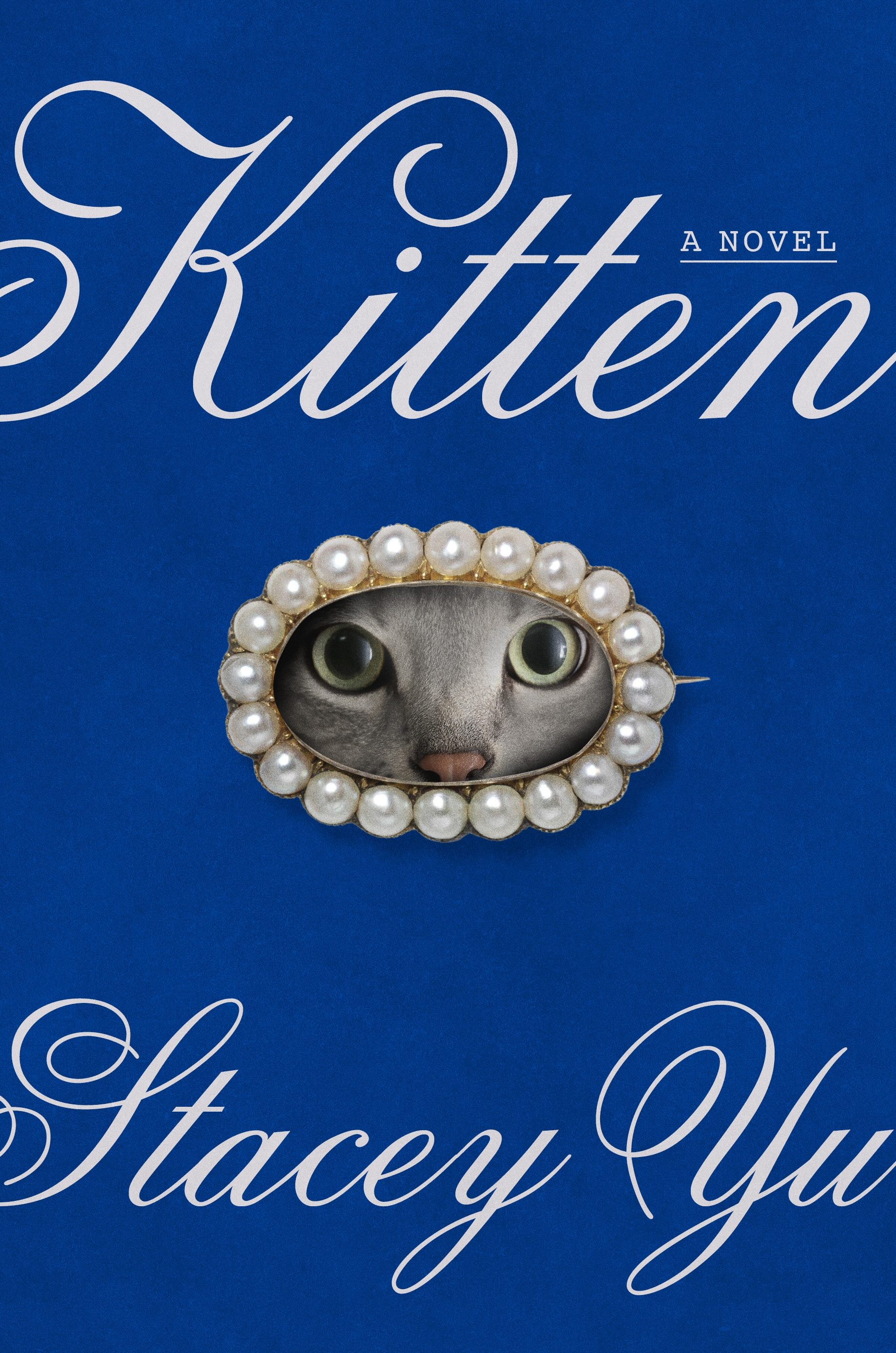
I had seen the moodboard from Stacey at our concepting meeting, and I tend to enjoy books from Stacey’s editor, Miriam Khanukaev, so I requested to work on it and read the manuscript. Miriam and I were schmoozing at bookclub one night after work, and she said something to the effect of “Stacey has all of these ideas and themes, but I think you’re the designer who will understand the vibe that she’s going for”. And right then I had the thought: I think it should be a cursive script, on a blue background, and it’s a lover’s eye, but inside the eye is a cat’s face. I don’t know that I’ve ever had a picture in my mind so clearly!
If I had to parse back my thinking at that moment, I think that blue fits because of the water, and the luxurious setting. But truthfully I also just like the color blue. Picture the cover in red, or pink… it just wouldn’t feel the same! Sometimes I just feel very strongly that a cover needs to be a certain color.
We did have a couple of alternate cover options that were well liked in cover meeting… but everyone knew right away that the lover’s eye was the right call.
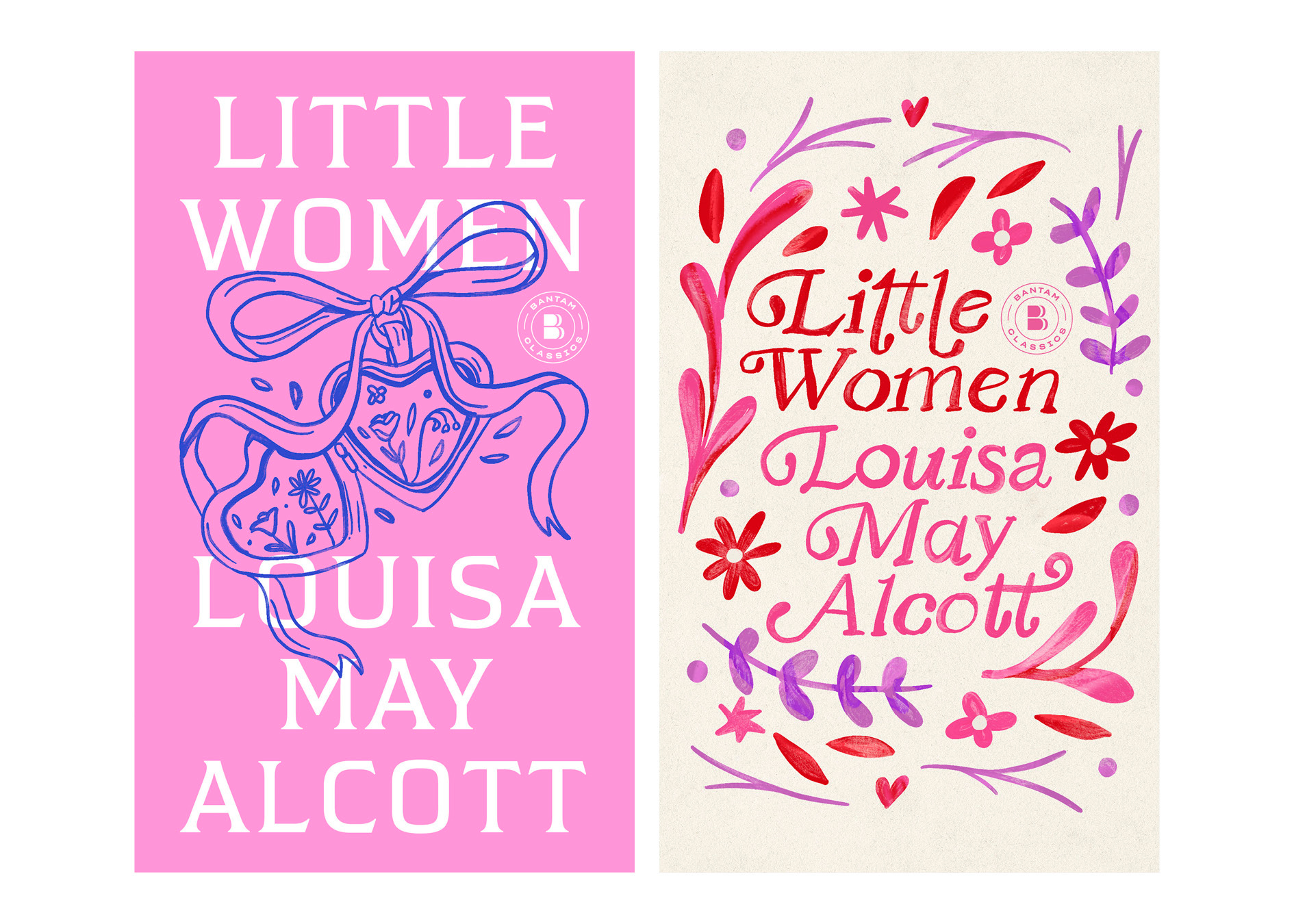
I am a true appreciator and collector of vintage jewelry, and I had just attended the winter NYC Jewelry and Objects show and had been handling all kinds of vintage Victorian pieces (see again, how inspiration can come from anywhere!). I had also just created a cover that was ultimately scrapped for an edition of Little Women that featured an open locket with different flowers inside representing the sisters. So I think the idea of something small and precious representing intimacy, love, and sisterhood, was clanging around in my head.
The brooch on Kitten is called a lover’s eye. What is the significance of that?
The lover’s eye was a jewelry trend popularized in the late 1700s, during the Georgian period. They were small, intimate paintings, commissioned for sentimental reasons, to a hold a piece of your beloved close to your heart. The tiny paintings were meant to be treasured, adored, and kept secret, similar to the trend in the same era of clipping a piece of hair into a locket.
For much of the story, Katie’s obsession with Silver is kept secret from her boyfriend, so I thought the lover’s eye was a perfect visual metaphor for her fixation on the preciousness of the cat. If you know what a lover’s eye is, the connection is instantly recognizable. If you don’t, hopefully the imagery is intriguing enough that you will pick up the book anyway!
I’m personally so excited to see you work your magic on the back cover. When does that process start for you? When you’re designing a front cover, do you also take into consideration what can be done on the spine, back, jacket flaps, etc.?
It happens much later than the cover design process! It can be difficult to design in the abstract without the jacket copy, which usually takes up a significant amount of real estate and limits what we can do imagery wise. We don’t get that copy until a few weeks before the jacket needs to route for approvals, which is a couple of months before the files are due to the printer. Most of the time we don’t even know the final spine size until shortly before the jacket goes to print! I can definitely have some ideas percolating in my head, but nothing starts on the jacket for at least a few months after the cover is designed.
Closing hour
You’re telling me a robot is going to think of putting the face of a cat in an antique brooch? I don’t think so.
Is there anything that would surprise people about the book design process?
You usually have to pay to use an award seal on a cover (like the Pulitzer Prize, National Book Award, etc), even though the book won the award! Not the Nobel Prize though, shoutout Nobel!! They don’t have a standard seal, so I got to design the Nobel Seal when Han Kang won in 2024.
One part that really amuses me is that we handle the licensing contracts. Like, why??? I’m not a legal expert! Sometimes agents will get into the weeds about changing certain details, and then it requires a lot of back and forth with either our department manager or the legal team.
Speaking of contracts, contrary to popular belief, AI is not being used on book covers for any big 5 publishers, because it’s currently illegal to do so. If you see AI being used, it means someone is in breach of contract. And on top of that, any of my coworkers will tell you I’m the #1 AI hater at Random House. You’re telling me a robot is going to think of putting the face of a cat in an antique brooch? I don’t think so.
What are three of your favorite covers you’ve designed, and three others have designed?
My covers:
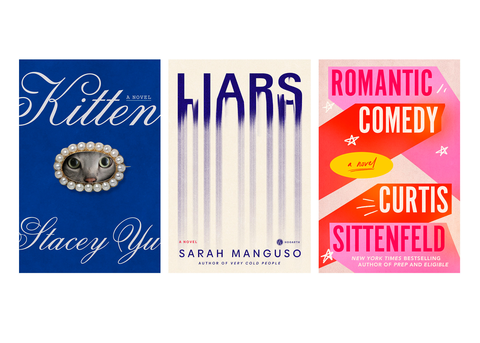
Kitten (duh), Liars by Sarah Manguso, and Romantic Comedy by Curtis Sittenfeld.
Others’ covers:
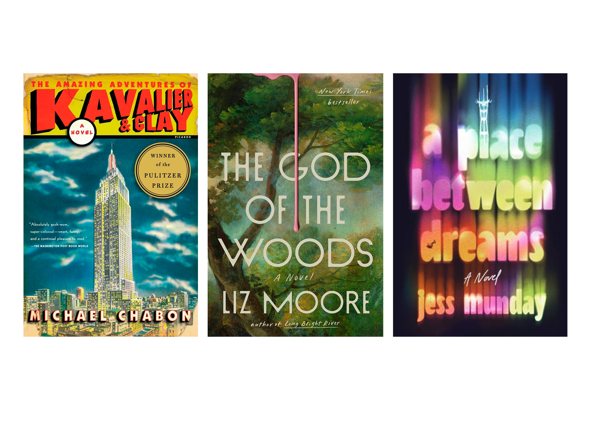
A childhood favorite: The Amazing Adventures of Kavalier and Clay by Michael Chabon (designed by Henry Yee), a recent icon: The God of the Woods by Liz Moore (designed by Grace Han) and a cover so good I wish I had designed it myself: A Place Between Dreams by Jess Munday (designed by Luísa Dias).
Anything else you’d like to add?
You can follow Cassie on Instagram and TikTok. This is her website.
A reminder that I’m running a pre-order raffle for Kitten, where if you email me confirmation of your pre-order, you will be entered to potentially win an advanced copy of the book, an exclusive print of the pictured oil painting by Bean M, and a bunch of other goodies that have some connection to the world of Kitten but are mostly just nice to have and pretty to look at: Le Labo Rose hand cream, a cat stamp and red sealing wax, a hyperrealistic oyster key chain, and a starched lace ornament.
If you are a Blue Hour subscriber, your entry will be doubled!
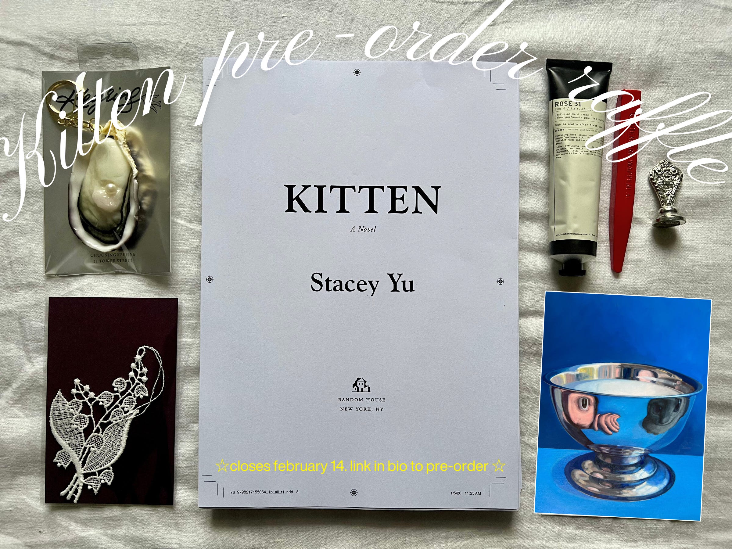
More details about the raffle below.

That’s all for now. Thank you for reading, and for your love and support for the book so far. I appreciate it all so so so much.
Until the next hour. xxx

Frontlist refers to the collection of newly released or forthcoming books that a publishing house is actively promoting and marketing.
Oooooooh I adored reading this, and what beautiful covers!
what a cool interview!!! i love experts talking about the wonderful niche things that make up our everyday lives!